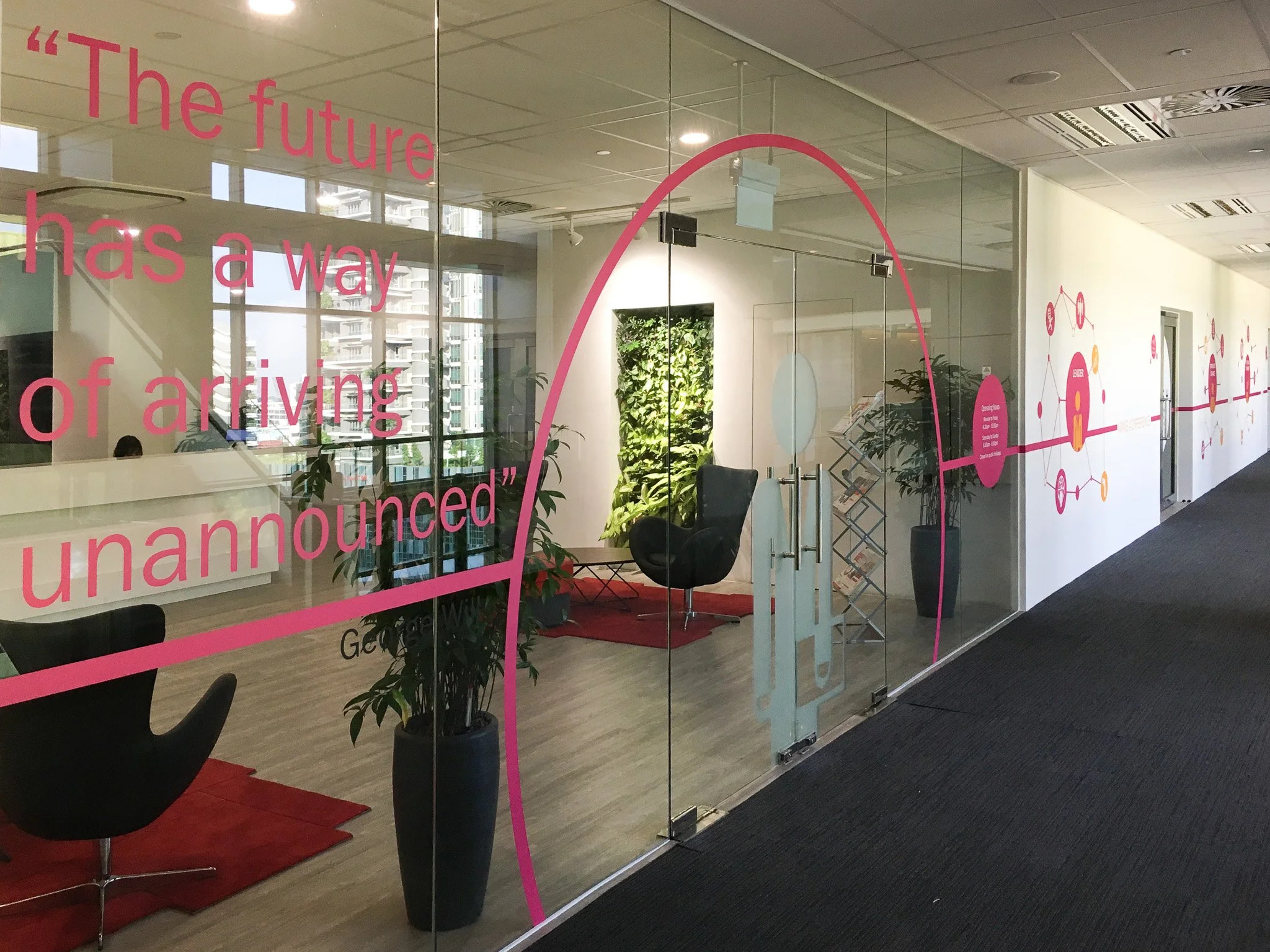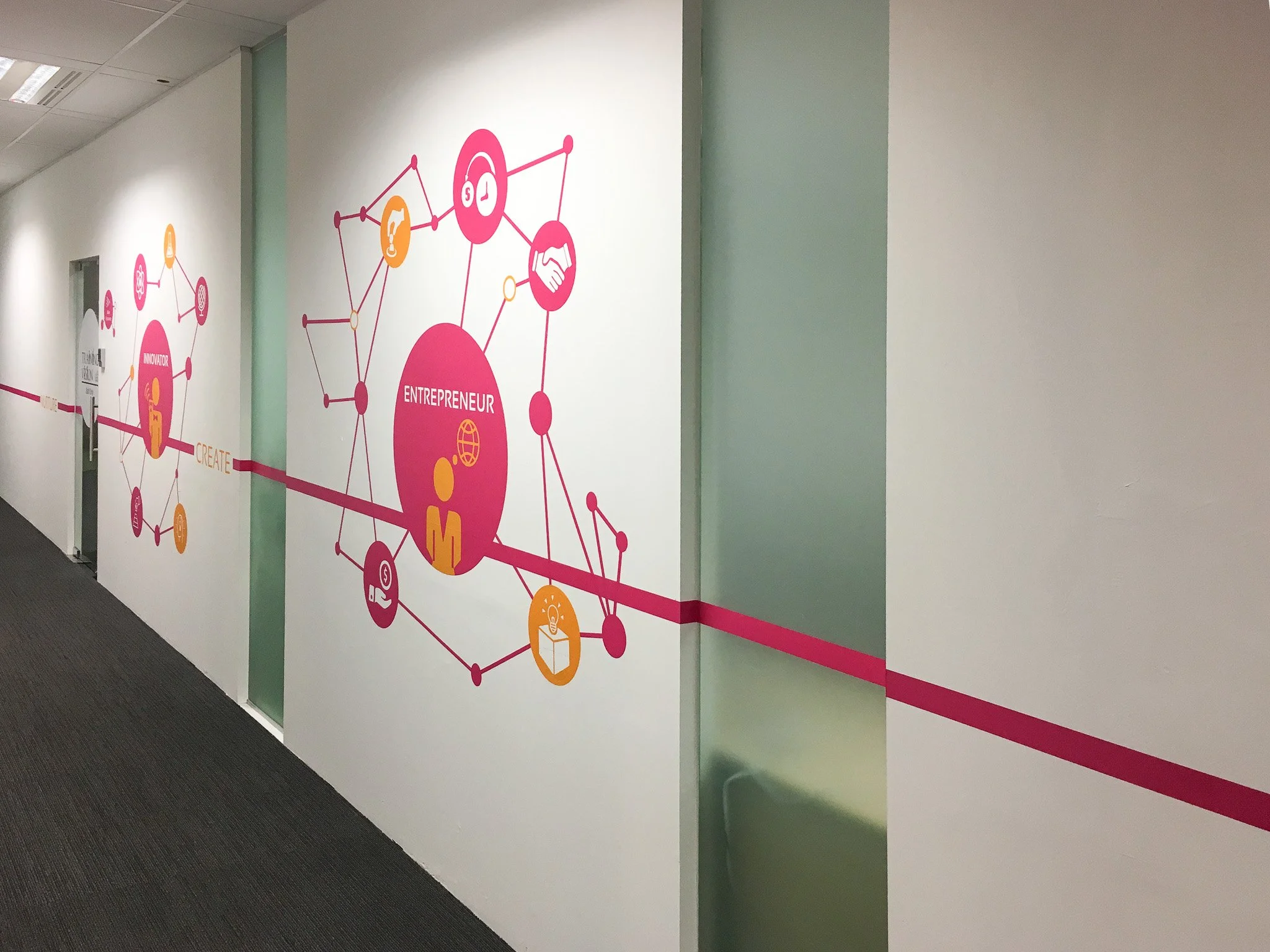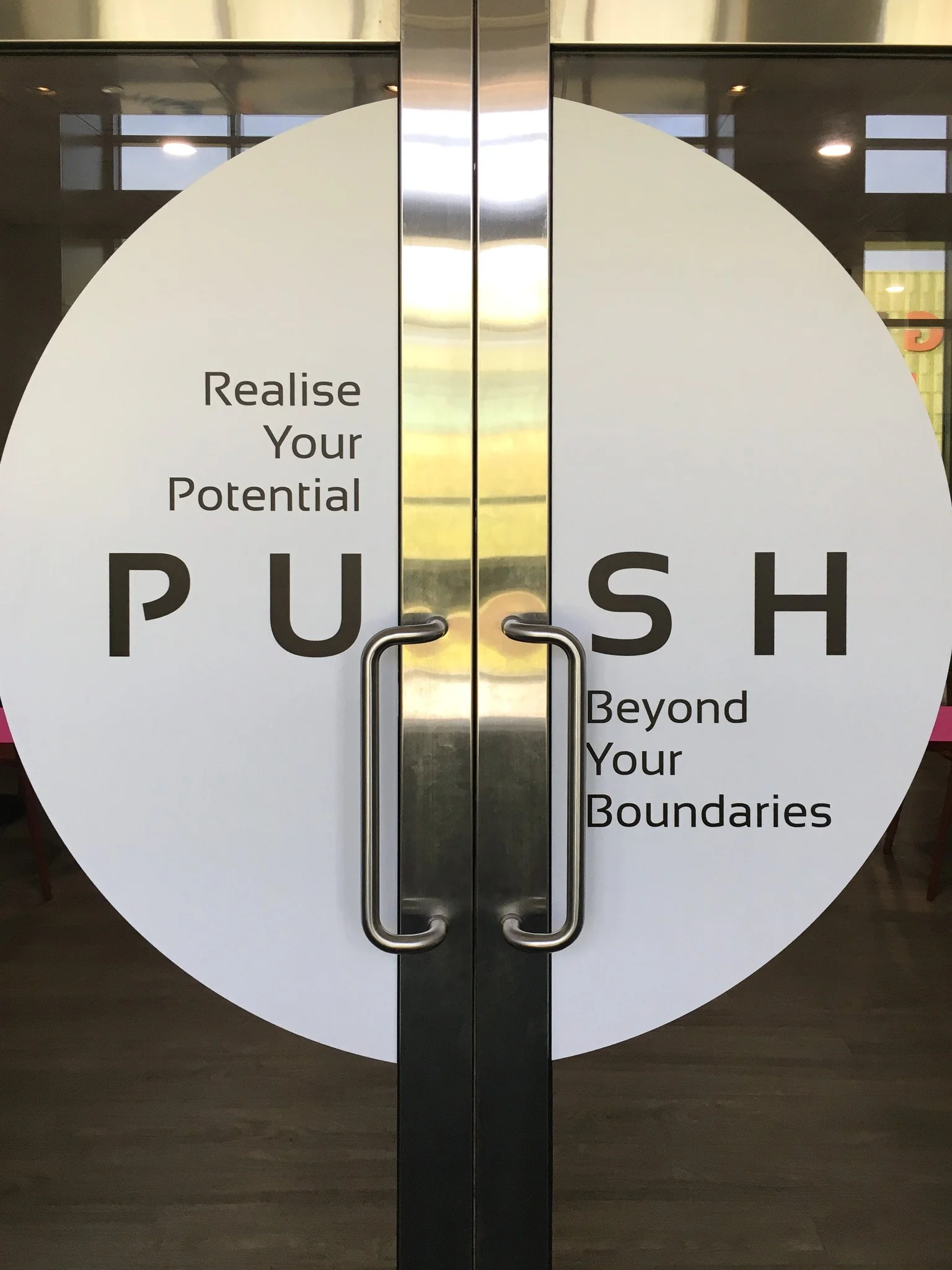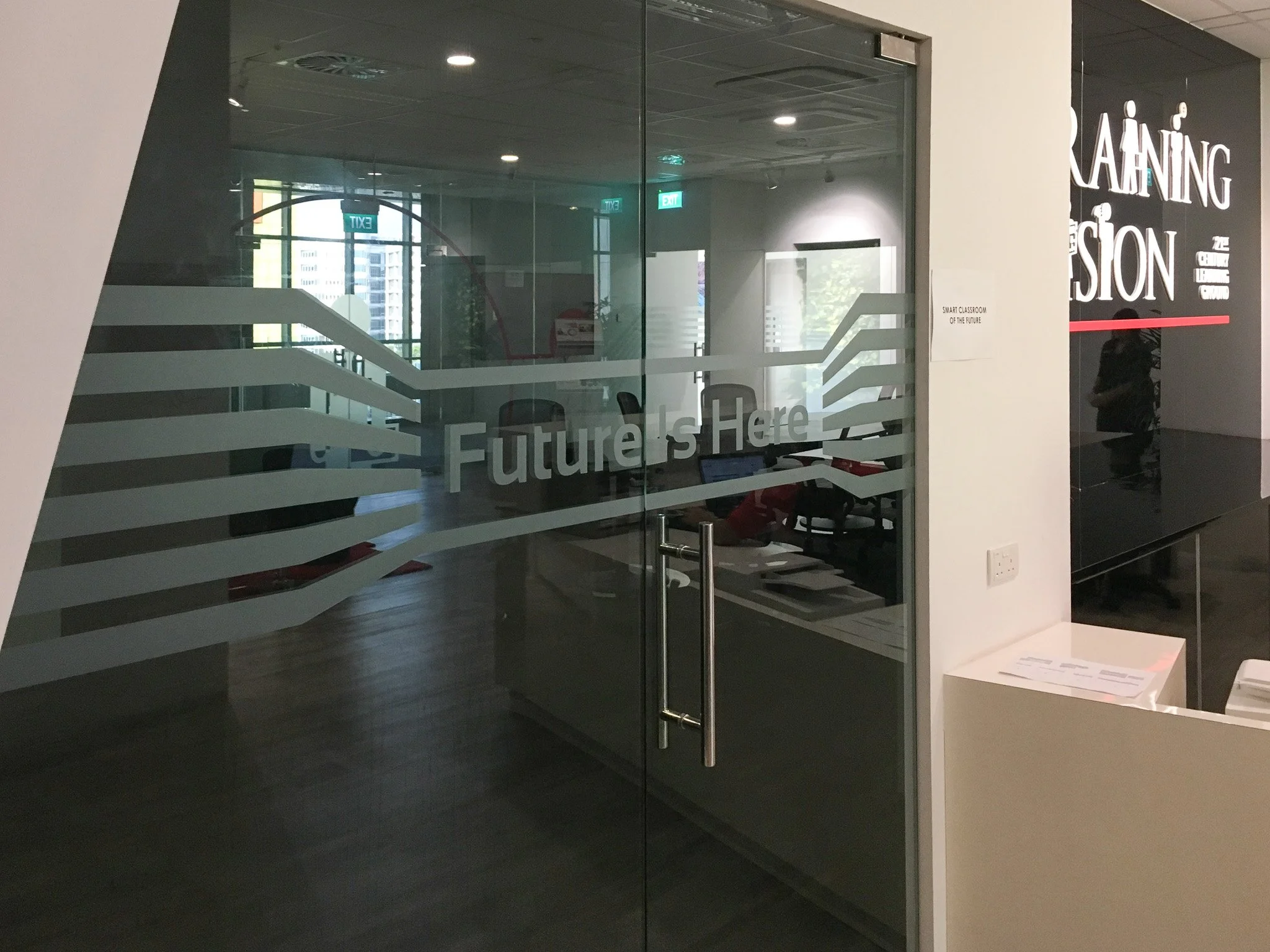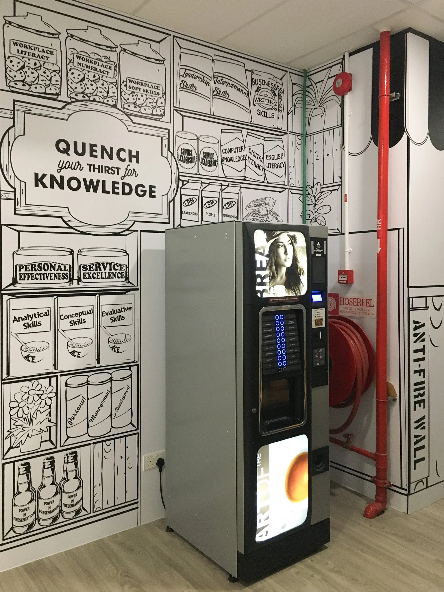

This project focused on environmental graphics applied across walls, doors, and glass surfaces within the space. A playful yet polished palette with pink and subtle orange tones that brings energy to the interior, while black and white decals on doors and glass add contrast and clarity. The graphics enhance wayfinding, reflect brand identity, and unify the space through a thoughtful, cohesive visual language.
CATEGORY
Commercial – Training Centre